Similar to their products, the whole online store employs the colors commonly used in pop art. The above-the-fold of the Home page will be randomly displayed with four different style and products.

As the user scrolls down the Home page, contrasting colors (from the brand color scheme) are used to divide different sections of the content.

A very strong Call to Action button for their Instagram account.

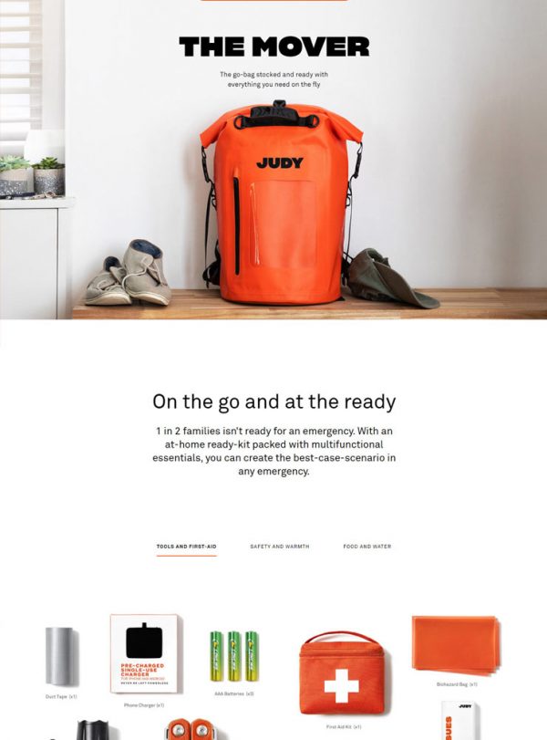
At the Product page, the extraordinary large product name is the first thing to catch your first attention.
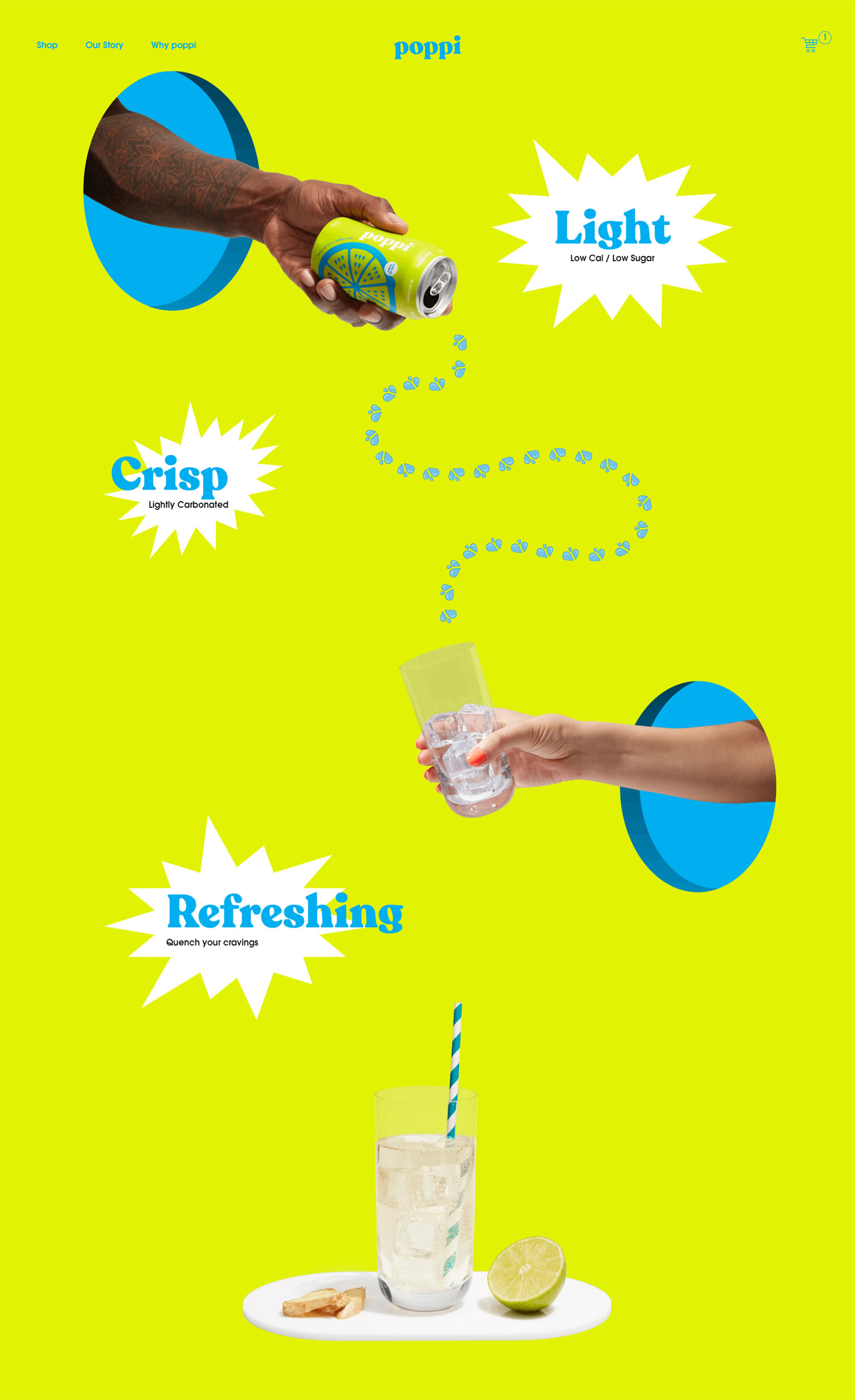
As we scroll down the Product page, it simply looks like a poster of pop art.

At the Our Story page, the founders tell you how they started the brand.

The colorful and eye-catching newsletter popup.

For the mobile view of the Product page (center), the Add To Cart button and quantity input remains sticky at the bottom of the screen when the user scrolls down. A common and easy pattern to let help the customers to purchase in a more convenient way.