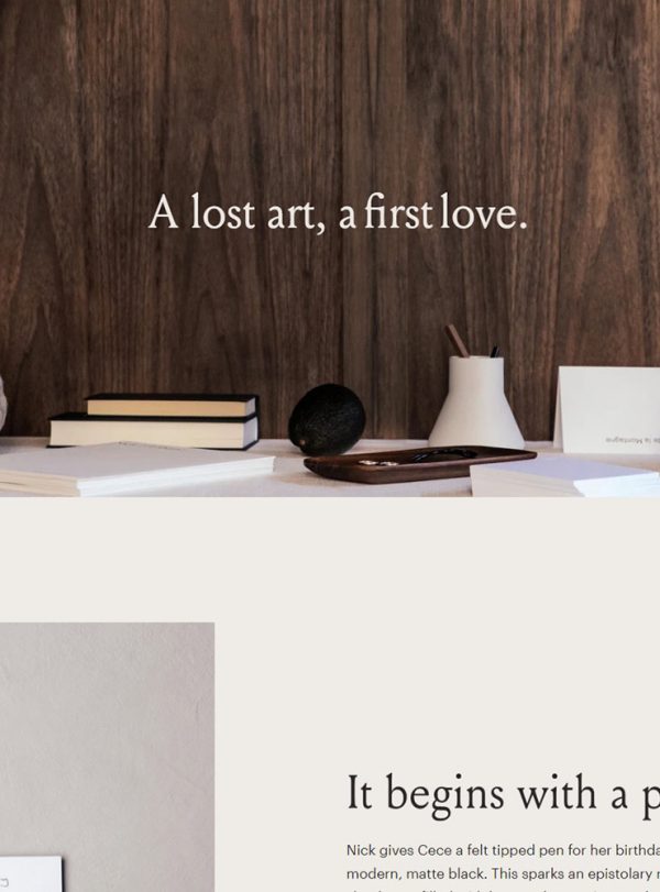
The Home page uses a grid layout with an orchestrated color tones for each section. The call-to-action button is clear for users to click and shop for the respective products.
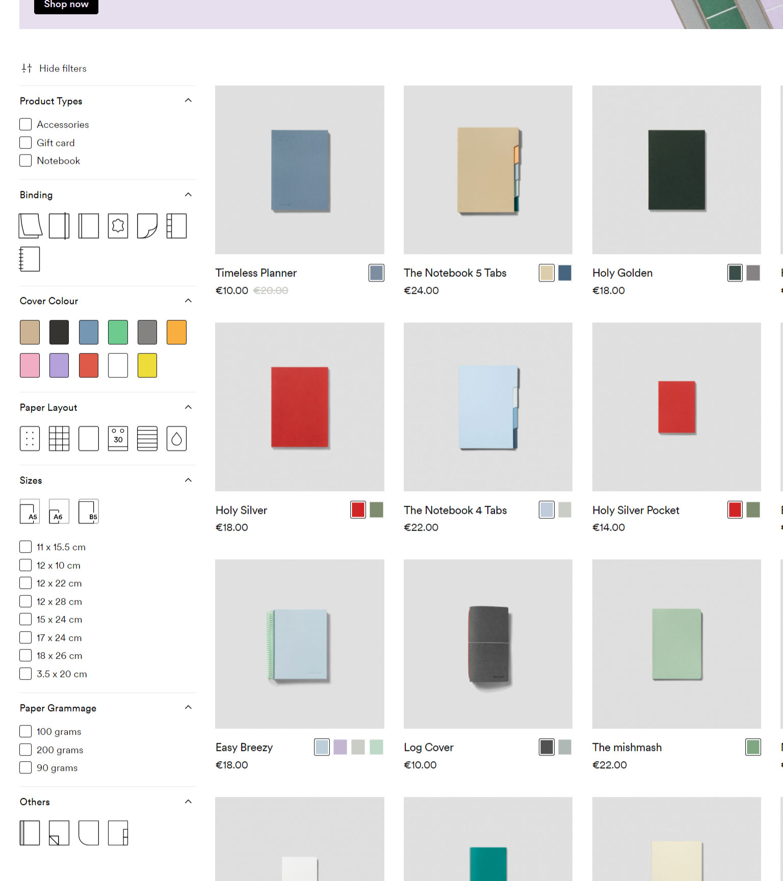
Since there are different variants for their product, filtering is important to let the users easily find out the products they are looking for. At the Collection pages, the filter is nicely designed to use icons to present some of the features of the products. For example, “blinding” and “paper layout” will be much straight forward to use the icons (with hover tooltips) to visualize the features rather than using a text description.

The icons used in the Collection page filter will be also used in the Product pages to indicate the product features. It does not just let the product info much easier to digest, but also makes the info presentation more consistent over the whole online store.

The Product pages contain rich info about the products that make the pages are relative long. In order to fulfill the main purpose to drive conversion, multiple “Add to cart” buttons are located all over the page in each section of content.

At the Blogs, the products related to the articles are cleverly placed on the right column close to the content mentioning the product. It makes the related products more outstanding and more tempting for the customer to visit the product page.

The concepts of the brand are presented on the About Us page.

The filter on the Collection page is still clear and easy to at the mobile view. As there are rich product details on the Product page, the multiple “Add to cart” buttons scattered on the page will help to save time for the customers to swipe back to the top for the key buying action.