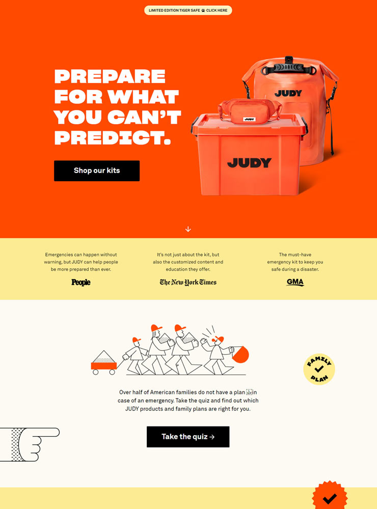
The Home page leaves plenty of breathing space among each element that makes the products stand out from the page.
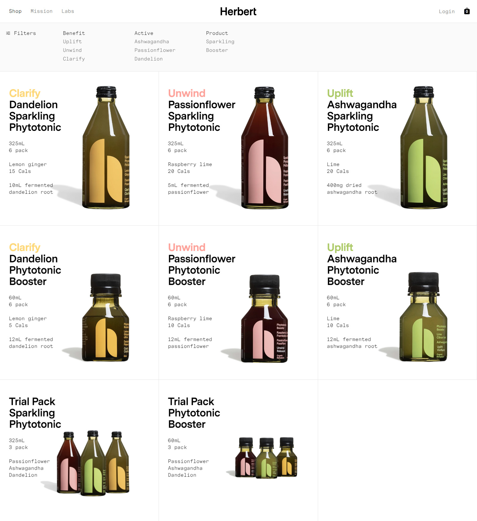
The filter at the Collection page is useful for the customers to sort out the beverages with different criteria.

The use of Messina Sans and Messina Sans Mono as the typography is one of the key elements that makes the overall look and feel modern and clean.

The mobile view of Herbert. At the Mission page and the Labs page (right), they tells you the ideas behind the brand and the products.