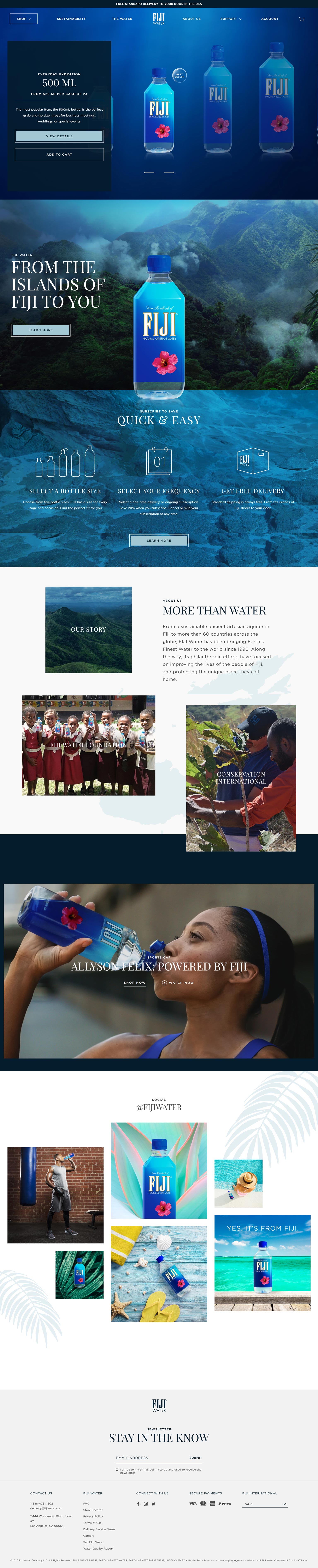
The blue color and the images of nature at the Home page can easily let the customer recognize the brand of the FIJI Water.

The customer can choose the subscription plan or one-time purchase at the Product Page. The “Subscribe & Save” button is placed on the left of the “One-time Purchase” button that can unconsciously let the users receive the message of subscription plan first and prompt the customer to opt for the subscription. For the Customer Reviews, the Hibiscus is used for rating instead of using the stars. Such small UI details can always bring joy to the users.

No matter it is one-time purchase or monthly subscription order, a related product is suggested when any item is added to the cart.
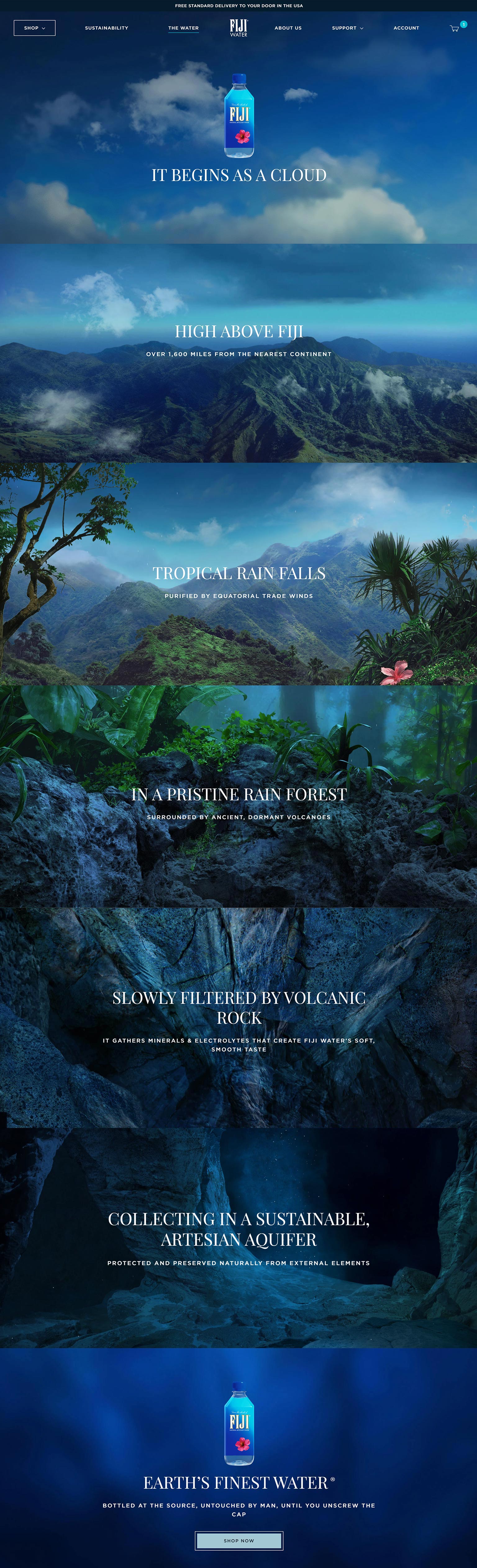
The FIJI Water Story is the surprise of the online store. It used simple copywriting matching with powerful images telling us the story of the FIJI Water from the sky to the aquifer. The colors of each image are well orchestrated to form a blue gradient from light to dark that subtly echo the flow of the water.

Instead of showing the input email field in the Newsletter Popup, a question about a direct dollar discount is asked to attract signups.