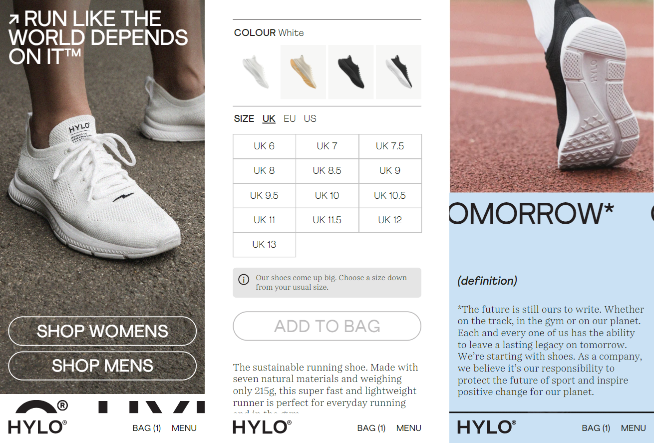
On the Home page, the four colors of the running shoes are placed at the position where the users can be easily discovered.

On the Product page, the background color changes according to the color of the running shoe selected by the user.
Different layers of materials are presented clearly with the collapsible content with the graphics on the right showing the regarding layers. It delivers complex information with a clever and simple layout and interactions.

The graphics help to assimilate boring specification and visualize it to the user.

According to a survey, “70% of consumers want to know what the brands they support are doing to address social and environmental issues and 46% pay close attention to a brand’s social responsibility efforts when they buy a product.” On the Materials page, it further explains how different parts of the shoes are made with different natural materials. This information is highly important to Hylo Athletics’s unique position to offer sustainable running shoes.

On the Our Process page, it used horizontal scrolling to present their workflow. From left to right, it matches with a natural perception about how a timeline progress.
Like the design of the desktop version, Hylo Athletics place their menu bar at the bottom of the site in the mobile version.